They were in a skip, but they were far from rubbish. A little Tippex and Sellotape never invalidated a table.
Their cream paper, hand-drawn grids and carefully written figures belonged to another era of data production—yet I found them immediately compelling. Numbers rarely remain numbers in my head for long: I look for their shape, rhythm and patterns. These tables made that instinct tangible.
They had surfaced during an office refurbishment at the Office for National Statistics, as years of working papers were cleared away. I saved a handful dating from around the time I was born.
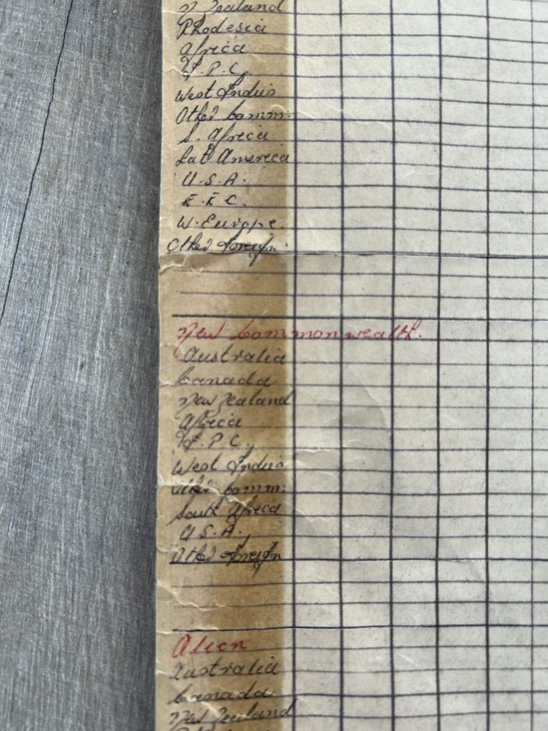
The sheets contained annual returns from the International Passenger Survey, dating from its earliest years in the 1960s. Their ordered rows and columns recorded passengers moving into and out of the UK—traces of journeys from a time when international travel looked very different and some countries had different names.
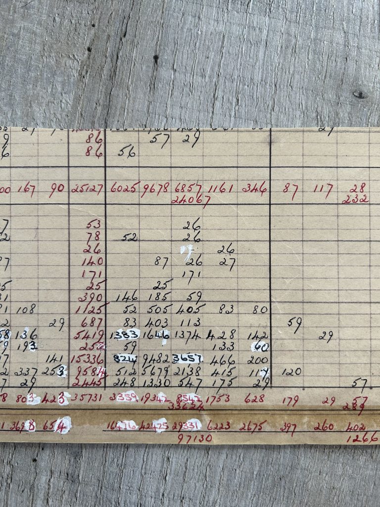
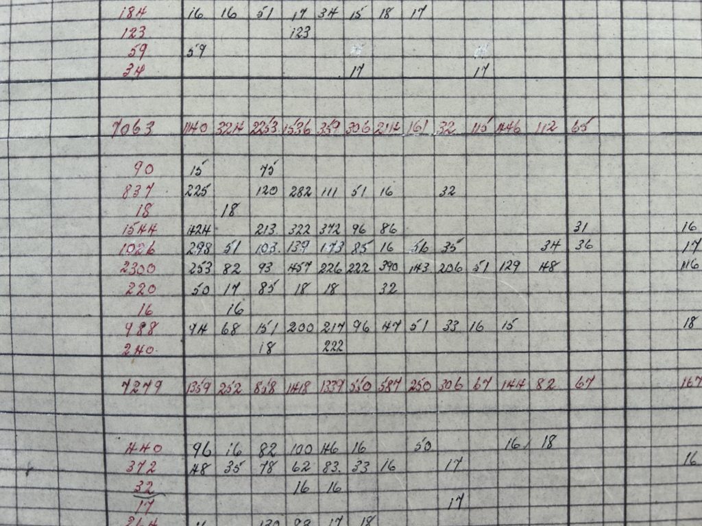
These were large, polished publications, each measuring 40.4 cm by 32.5 cm, produced before creating a table was as simple as opening a spreadsheet. The Sellotape had yellowed against the cream paper and was falling away. Every line had been ruled by hand, while distinct styles of handwriting fitted words and figures precisely into the grid. Before I had read a single number, I could see the care behind it.
Seeing the work behind the numbers
Their dense columns, ruler-drawn lines and elegant handwriting gave them a character that modern outputs rarely possess. Bright patches of white Tippex stood out against the cream paper, showing where mistakes had been corrected. Beneath the lifting Sellotape, large sections of the tables showed signs of revision.
That visible labour changed how I saw them. Statistical tables can appear neutral and inevitable, as though figures simply arrive in rows and columns. These pages revealed a document designed, checked and repaired by people. They preserved not only statistics, but a way of working built on concentration, patience and practical skill.
The more closely I looked, the less the tables felt like material to use and the more they felt like work I needed to respond to.
From statistical output to artwork
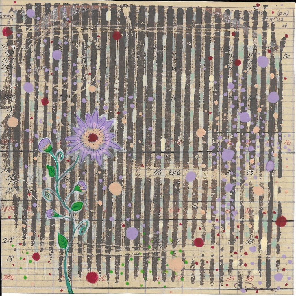
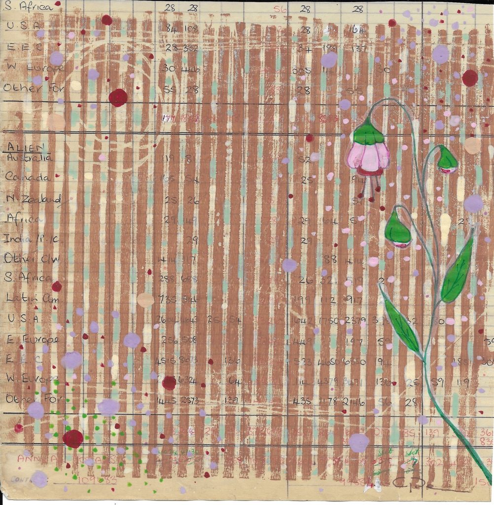
I held onto the sheets for years, unsure how to approach them and slightly intimidated by their importance. When I began, I studied where the grids became dense or opened into white space, and where labels and corrections interrupted the pattern. These were not imperfections to remove; they were part of what made the tables distinctive.
As I began to turn a statistical document into art, I kept asking how I could alter it without erasing what mattered. For me, respect meant keeping the source legible and preserving evidence of its purpose. The important thing was that the tables would once again be seen.
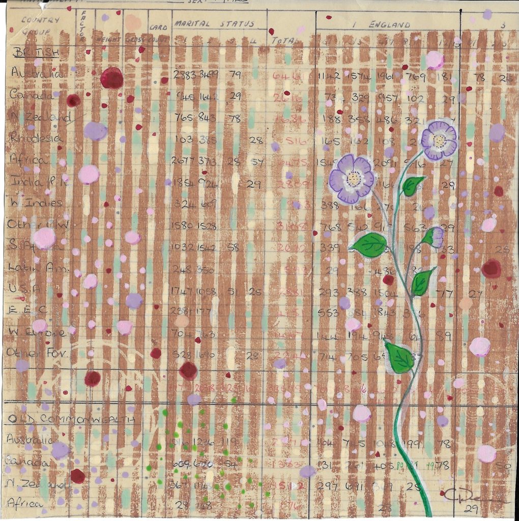
Inspired by the repeating patterns of DNA, I introduced a second linear pattern. Using a palette drawn from the aged paper, I gel-printed irregular rows of blobs from corrugated cardboard across the ruled lines. Rulers and cardboard tubes interrupted the transfer, leaving voids through which the handwriting and original grid remained visible.
I then painted a favourite flower from my garden on each table, using the same muted palette. The organic forms contrasted with the rigid grid, bringing together my interests in plants and data.
Giving the tables another life
Making art from the tables changed how they could be noticed, but I did not want to obscure their original purpose. The handwriting, corrections and ruled lines remained visible because they were part of the work, not imperfections to disguise. People who have seen the artwork have been curious about the data behind it.
They also connected me with the people who made them. Had I been working at the ONS then, I might have been one of them. They were doing the same job I do now—turning data into something accurate, clear and useful—only with different tools. These tables showed me that mistakes do not diminish the quality of the work; recognising and correcting them is part of doing it well.
Leave a Reply