Tables are excellent for looking up exact values. Charts are better at revealing patterns. But what if we need both at once?
I would like to propose a name for a simple hybrid format: the chable—a combination of a chart and a table.
What is a chable?
A chable is a table with one or more compact charts embedded within its structure. It combines the precision and context of a table with the ability of a chart to reveal patterns quickly.
The charts might include sparklines, small bar charts, dot plots or other restrained forms. They must add analytical value by revealing a trend, comparison, ranking or exception that would be difficult to identify from the values alone. The surrounding rows and columns provide the exact figures, labels and context needed to interpret the pattern.
A chable is a focused analytical view, not a replacement for the complete dataset. It only needs to include the variables required to support its analytical purpose; readers can use the accompanying dataset for further detail.
A chable retains a consistent row structure: each row represents one item, and each column presents the same type of information for every item. If that structure is broken—for example, if each row contains separate measures or visualisations arranged as individual panels—the result is better understood as a dashboard than a chable.
This idea has an earlier precedent. In the February 2012 article “Grables and taphs”, Cole Nussbaumer Knaflic asked whether it was possible to “combine the visual power of a graph with the detail of a table”. She used the terms grable and taph for these combinations. This closely aligns with the concept described here. Chable is proposed as an alternative name for this established approach, rather than as a claim to have originated the format.
The term “chable” emerged while we were developing Business insights and impact on the UK economy in November 2021, when we used sparklines within a table. Similar formats have also been described as micro charts in tables, inline charts and enriched tables. “Chable” provides a concise name for this combination of chart and table.
When to use a chable
Use a chable when readers need to scan patterns across many rows and still look up exact values. It is particularly useful when each row represents a comparable item—such as a region, service, product or indicator—and the compact chart answers the same analytical question for every item.
- Combine overview with detail. Readers need both a rapid visual scan and precise figures, labels or supporting measures.
- Compare a manageable set of rows. The rows share a consistent structure and can use the same chart form, scale and visual encoding. The entire component can fit on a screen comfortably.
- Support a clear task. The chart reveals a trend, magnitude, rank, benchmark, variation, uncertainty or sequence that is harder to see from numbers alone.
- Keep context close to the pattern.
- Save space without removing meaning. Repeating full-sized charts would be cumbersome, but a conventional table would hide useful patterns.
When not to use a chable
- Use a conventional table when the main task is to retrieve exact values, compare text, or inspect many fields and the visual pattern adds little analytical value.
- Use a full-sized chart when the overall story matters more than row-level lookup, or when readers need axes, precise time points, annotations, interactions or detailed distributions.
- Avoid a chable when rows require different scales, chart types or colour meanings that make direct comparison misleading.
- Avoid a chable when there are too many rows or columns for the display to remain legible, particularly on narrow screens or at high zoom.
- Avoid a chable when the underlying values or an accessible equivalent cannot be provided.
- Avoid decorative mini charts. If the graphic does not answer a specific analytical question, it adds complexity without improving understanding.
A simple test: if removing the compact charts would make an important pattern materially harder to see, while removing the table values would make the result insufficiently precise or informative, a chable may be appropriate.
Examples of chables
Start with what the reader needs to understand, then choose the compact chart that best supports that task. The chart column provides the visual pattern; the other table columns provide the precise values, context and supporting measures needed to interpret it.
Show a trend over time
Business insights and impact on the UK economy
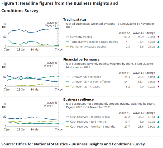
Use a compact line chart when the main task is to identify whether each row is rising, falling, stable or volatile over time. Keep recent headline information—such as the latest value, previous-period change or latest date—in adjacent numeric columns so readers can see the pattern and verify the current position without extracting an exact value from the chart. The analytical question is: How has each opinion changed over time, and what is its most recent position?
Compare magnitude and rank rows
Productivity flash estimate and overview, UK: January to March 2026 and October to December 2025
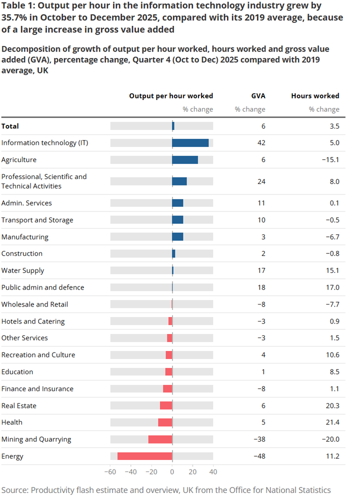
Use compact bars when the main task is to compare the magnitude of one numeric column and rank the rows from highest to lowest or lowest to highest. The bar should use a common zero baseline and share a consistent scale across every row. The analytical question is: Which industries have the extreme values?
Design decisions
The chable should build on established table design decisions rather than treating the table as a neutral container.
The chable should be labelled as Table X, rather than Figure X, when included in a report.
For a chable, all columns containing numbers—including counts, percentages, rates, changes and measures of time—should be right-aligned consistently. Row labels and other textual categories should remain left-aligned. Compact charts can occupy their own column, but their plotted values should use a shared baseline or scale wherever readers are expected to compare rows. This creates a clear reading pattern: labels on the left, comparable figures aligned by place value, and the visual summary in a predictable position.
Treat the compact charts as small multiples. Where readers are expected to compare charts across rows, each chart should use the same chart type, dimensions, axis ranges, units, baselines and visual encodings. Colours should retain the same meaning throughout: use a consistent main colour, apply any highlight colour to the same category or condition, and avoid assigning different colours merely to distinguish rows. If a different scale is unavoidable, label it prominently and make clear that direct visual comparison is limited.
Designing chables for accessibility
- Do not rely on colour alone. Use labels, symbols, line styles or direct values to communicate categories, targets, increases and decreases. Ensure sufficient contrast between foreground and background colours.
- Keep text and values readable. Avoid small labels within compact charts, and ensure that text and values remain legible when enlarged or zoomed.
- Preserve table relationships. Captions and headings should clearly identify what each row and column represents so screen-reader users can understand the context of a value.
- Provide a non-visual summary. State the principal pattern or comparison in nearby text when it is important to the message—for example, “Advice visits increased over five quarters, while Licensing visits declined overall.”[RN1] This could also be visually hidden, so that it is read to screen readers only.
- Plan for narrow screens. Where a chable needs horizontal scrolling, keep row and column context clear and avoid hiding essential values. If the layout becomes difficult to understand, provide a simplified table or another accessible presentation. Some columns may need to be dropped for a mobile version.
- Test the completed component. Check keyboard navigation, screen-reader output, zoom and reflow, high-contrast settings and the experience without colour before publication.
A starting set of principles
- Start with an analytical purpose. The compact chart should answer a specific question—such as how values compare, how they have changed or where an exception lies—that the table alone makes harder to see. What are your key messages?
- Apply small-multiples conventions. Use consistent chart forms, axis ranges, units, baselines and colour meanings wherever compact charts are intended to be compared. Independent scales can make very different magnitudes look alike.
- Keep the visual treatment restrained. Labels, lines and colour should clarify the data rather than compete with it.
- Preserve exact values and context. Include units, time periods, sources and explanatory notes where needed. As with all data visualisations – consider how the chart might be interpreted away from the content it’s published in.
- Design for accessibility from the start. Preserve the table’s meaning for assistive technologies, do not rely on colour or the graphic alone, and provide equivalent values and a concise text summary of any essential visual pattern.
A proposal, not a finished definition
“Chable” is a proposed term, and this introduction is intended to start a conversation. Does the name help distinguish a thoughtfully designed analytical hybrid from any table that happens to contain a miniature chart? What rules would make the format recognisable, useful and trustworthy? Examples, critiques and alternative definitions would all help refine the idea.
Leave a Reply