I have always felt an urge to see data—to lift it out of rows of numbers and turn it into something visible, meaningful and capable of telling us more. A childhood chart drawn in pencil and my first attempt at coding with D3 may seem worlds apart, but to me they are points on the same line: moments when data became information.
Some firsts stay with us because they mark the beginning of something, even if we do not recognise it at the time. I made my first chart when I was about eight years old, using only a pencil and a sheet of graph paper. Years later, I experienced another first when I joined the data visualisation team at the Office for National Statistics and began using D3.js to create charts in code. Looking back, these experiences feel less like separate events and more like chapters in the same story.
The first first: pencil, ruler and graph paper
I cannot remember whether I thought of it as “data visualisation” then. I only knew that I was turning numbers into a picture. The graph paper gave me structure: neat squares, straight lines and a place for every mark. I could count the squares, draw a line, then stand back and decide whether it looked right.
My first chart happened in a side room in Shortlanesend County Primary School (now an office for a safety equipment supplier) in a class of about 10. I cannot remember what data the chart showed. I am fairly sure it was a straight line—but the precision was delicious. Here were numbers, transformed into a picture.
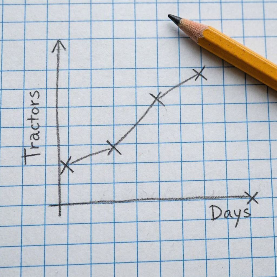
Not the original chart—this is an artist’s impression.
What stayed with me was the small transformation taking place on the page. A list of values became a pattern; differences could be seen rather than merely read. Even at eight, I felt the pull to make numbers visible—as though I could not fully understand them until I had given them a shape. I was learning something fundamental: a chart is not decoration added to numbers. It is a way of turning data into information.
I still feel a deep attraction to the hand-drawn, sketchy style of visualisation.
The second first: joining the ONS data visualisation team
My second first came much later, when I joined the data visualisation team at the Office for National Statistics. This time, there was no graph paper. Instead, there was JavaScript, HTML, SVG and D3.js—a flexible toolkit for connecting data to visual elements on a web page. Rather than counting squares with a ruler, I was working with scales, axes, selections and code.
The experience felt both familiar and completely new. What felt familiar was the impulse behind it: I still needed to see the data before I felt I truly understood it. A chart was the bridge between raw values and meaning—a way to reveal a pattern, frame a question and help others grasp what mattered. What was new was learning to express every decision precisely. Where should each mark sit? How should the chart respond on a smaller screen? Which labels were essential? What would make the result clear and accessible to someone encountering it for the first time?
My first D3 visualisation was a divorce chart showing the proportion of marriages that ended in divorce after different lengths of time. It also included a short sentence that translated the figures into plain English, helping readers understand what the data meant—not just what it showed.
I did not create it alone. I had a great deal of guidance from my mentor at the ONS, who helped me make sense of the code, work through problems and understand the thinking behind the chart. That support gave me the confidence to experiment and begin finding my own way with D3. I was amazed at the creative freedom that I had!
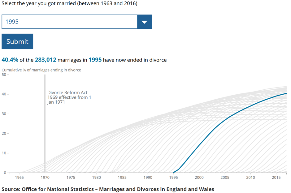
Using D3 changed my relationship with charts. I was no longer simply drawing a finished form; I was building the rules that produced it. The data could be updated, elements could respond, and the same logic could create visualisations for many different values. The chart had become reproducible and interactive, but the central challenge remained the same: to make the message clear without losing the truth or complexity of the data. Even so – the chart was made up of lines, circles and rectangles – those basic building blocks.
What connects them
On the surface, my first two charts belong to different worlds. One was physical, quiet and fixed on paper; the other was digital, technical and able to change in a browser. Yet both began with the same impulse: to discover what the numbers looked like.
I felt the same pull in both moments: a need to take the numbers in front of me and discover what they looked like.
- Both gave me the satisfaction of watching something abstract become visible before my eyes.
- In each case, I became absorbed in the detail—the sort of concentration that makes the rest of the world briefly disappear.
- Most importantly, both confirmed something about me: I understand data best when I can give it a shape and make its meaning visible to others.
The tools have changed enormously, but the urge has not. I still find it difficult to leave data sitting silently in a table. I want to see its shape, spot its exceptions and understand the story in the relationships between its values. For me, visualisation is the point at which data becomes information—and information becomes something we can question, understand and share.
Still drawing, differently
If I could place those two versions of myself side by side—the eight-year-old carefully drawing a pencil line, tongue peeking out in concentration, and the new team member making a chart appear through D3 code, tongue in exactly the same position—I think they would recognise each other immediately.
My degree is in mathematics, but I would also call myself an artist. Logic and creativity are sometimes described as belonging to opposite sides of the brain, but data visualisation shows how closely they work together. Mathematics helps me identify the patterns in the data; art helps me decide how best to show them. Data visualisation is where those skills meet, combining accuracy with creativity to make information easier to understand. That first pencil line was more than my first chart. It marked the beginning of a lifelong need to turn numbers into something we can see—and, by seeing, understand.
Leave a Reply