On hazel eyes, wandering words, data visualisation, and the exhausting business of seeing things properly
My eyes are hazel, a colour often described as relatively rare and sometimes estimated to occur in roughly 5% of people globally. This would be more impressive if they did not also object to light, struggle with words, occasionally flatten the world into two dimensions, and generally behave like two highly opinionated marbles. They are very pretty, though.
Early signs
I think the earliest warning sign was much earlier than I first remembered. I must have been about three, and I remember having to hide my eyes from bedside lamps in the morning because the light felt unbearable. Not sunlight. Not a dramatic spotlight. Just an ordinary bedside lamp, innocently trying to illuminate the room while my eyes reacted as if it had personally insulted them.
I did not have the words for it then, obviously. At three, your diagnostic toolkit is fairly limited. But looking back, it is strange to realise that my eyes had been objecting to light long before anyone thought of it as “a problem”. They were not being difficult, exactly. They were just submitting feedback very early.
A few years later, there was another warning sign. I was walking down St Clement Street when the brightness was so intense that I genuinely could not keep my eyes open. Not in a “bit squinty, where are my sunglasses?” way, but in a “apparently daylight itself has chosen violence” way.
Bright days could feel physically overwhelming. Other people seemed to be strolling along normally, while I was doing my best impression of a startled mole with responsibilities. At the time, I did not connect it to anything bigger. It was just one of those moments where my eyes filed a formal complaint about existing.
The maths lesson
I first knew something was wrong with my eyesight when I was about 14. I was sitting at the front in a maths lesson, because the clever people — the ones who were really good at maths — sat at the front. And I was happy to be there. I was proud of being good at maths.
And then I realised I was struggling to read the text. Not in a casual “that’s a bit blurry” way, but in a “why is this taking up 80% of my available brain power?” way. The words were there. My eyes were present. But the whole process felt like trying to read through cling film while my brain complained to management.
That was what made it so unsettling. Maths was something I was good at. So when reading the text suddenly took more mental effort than the maths itself, it felt deeply wrong. The problem was not that I could not understand the work; it was that I was having to fight my way through the act of seeing it.
A very historic eye test
After that lesson, I did what any sensible teenager would do: absolutely nothing useful for a bit. But eventually I decided I probably should ask my parents if I could go for an eye test. This took place at Walsingham Place in Truro, which is a place of actual history and beauty, and therefore a very dramatic setting for me to discover that my eyes were not, in fact, pulling their weight.

Before it became a handsome Georgian terrace, it had been boggy land, known as Caribee or Cribby Island, complete with wrestling matches, a pub, a brewery nearby, and at one point enough sewer-based horror in the river to make you grateful for modern plumbing.
Nearby, a former maltings was apparently lost in a game of poker and later used by Mallett’s as a store for coffins, where male employees were apparently known to sleep after a night out, presumably giving the shop girls the sort of morning greeting that requires both smelling salts and a new job. Later Walsingham Place almost got demolished, until John Betjeman helped save it, which means I can honestly say my eye test took place somewhere rescued by poetry and lightly haunted by hungover coffin-men. Naturally, I was there to contribute to this proud heritage by failing to read small letters on a chart.
The verdict from the eye test was slight hyperopia, or long-sightedness, and I was given glasses. This was both reassuring and mildly disappointing, because part of me had expected the glasses to arrive with a full Bittersweet Symphony style orchestral soundtrack and instantly fix everything. They helped, but they did not properly address the real problem: the words still had a tendency to float away from where they were supposed to be, which is a deeply unhelpful quality in words.
Since then, I have done some research into things like visual stress and Irlen Syndrome, because when words are wandering around the page, you do eventually start Googling like a person trying to solve a very niche haunted-house mystery. Some of it sounds familiar, but none of it has ever felt perfectly aligned. It is another one of those almost-explanations: useful, but not quite the whole shape of the thing.
At first, I assumed the problem was somehow my fault. Maybe I was tired. Maybe I wasn’t concentrating hard enough. Maybe everyone else was also silently wrestling the text into focus and simply being much more elegant about it. So, naturally, I carried on squinting, guessing, and developing the sort of facial expression that makes you look permanently suspicious of signage.
When words refuse to behave
When I read, and even more so now that I am a little older, the words tend to wander around the page. They do not stay politely in their lanes, as words really ought to. Black text on a white paper or screen background is particularly outrageous. The words blur, shimmer and glow, almost as if they are burning into the background — which sounds dramatic because it is dramatic. I often have to read the same bit over and over again, not because the content is especially profound, but because my eyes appear to be running their own tiny chaotic interpretive dance.
People often talk about reading as if it is automatic, but for me it can feel like physically holding the words in place. It takes effort before I have even got to the meaning. By the time I understand the sentence, I may already have spent a surprising amount of energy simply persuading the sentence to remain a sentence.
And before anyone suggests Dark Mode: sadly, no. Dark Mode most definitely does not help me. The high contrast does not soothe my eyes; it makes the whole reading experience so visually shouty that I immediately want to stop reading and paint a picture instead. This is not always ideal during working hours, although arguably more aesthetically satisfying.
There is another odd thing my eyes do, which is slightly harder to explain. My depth perception is not always brilliant. Sometimes things seem to go strangely flat, almost two-dimensional, and the world feels as if it is sloping away from me. This is inconvenient in all the obvious ways, but especially around glass. I do sometimes bump my head because I cannot quite tell how close I am to something, which is a very undignified way to discover that windows remain, inconveniently, solid.
How it shows up in my art
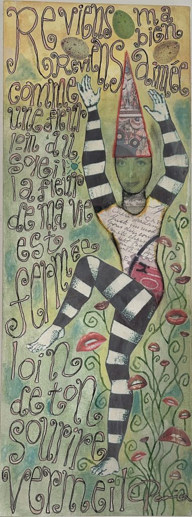
It has affected my art too, although in a way that took me a while to notice. Someone once looked at my work and said, “Oooh, you can tell that’s you because it’s all pastel colours,” and I thought, yes, apparently my entire artistic personality may be an elaborate coping strategy. Muted tones are calming for me. They do not shout. They do not vibrate. They simply sit there, behaving themselves, which is more than I can say for black text on a white background.
This is probably why I am so fond of soft, earthy colours. We have just had our bathroom refitted in a gorgeous muted green and terracotta, and honestly, my eyes have never been more grateful for interior design. It is soothing, warm and gentle — the visual equivalent of someone making you a cup of tea and not asking you to read a spreadsheet.
I think this also explains why words turn up in my art in the way they do. I use muted, natural tones, and when I add words they are often twisty, spirally and curly — definitely not lined up neatly like well-behaved little soldiers. I used to think this was just taste. Maybe it is. But it is also comfort and control: a way of making a visual world I can actually relax inside, where the words are allowed to be honest about their true nature.
Seeing badly, but making it work
Since then, my eyesight has become one of those background things I manage every day. It is not always dramatic, and it is not always visible to other people, which is part of what makes it tricky. From the outside, I might look like I am thoughtfully considering a spreadsheet. Internally, I may be trying to persuade a line of numbers to stay in an actual line, which feels like a fairly basic request and yet somehow remains up for negotiation.
Work, unfortunately, involves quite a lot of seeing. This feels like a design flaw. Screens, slides, emails, charts, dashboards, meeting notes, shared documents, PDFs that refuse to behave — the modern workplace is basically one long eye exam with calendar invites.
There is a particular irony in doing data visualisation work with eyes like mine. I spend a lot of time making sure charts are accessible to other people, including people with colour blindness, and that information does not rely on colour alone. But sometimes I have to temporarily change the colours or contrast just so I can work with the content myself, then change it back before publication. I end up designing in one visual world and publishing in another.
Some days, I can get on with things with very little fuss. Other days, my eyes get tired quickly, and tasks that look simple on paper take more effort than people might realise. Reading dense text, comparing lines of numbers, checking labels on charts, or moving between multiple screens can be draining. It is not that I cannot do these things; it is that my eyes sometimes like to make a simple task feel like a side quest.
One of the hardest parts is explaining the problem to people at work in a way that actually makes sense. “My eyes are tired” does not quite cover it. “The words are floating away and the colours are staging a coup” is more accurate, but does make you sound like you have accidentally wandered into a Victorian séance. It can be difficult to describe something that is happening inside your own vision, especially when everyone else is looking at the same screen and apparently having a normal time.
One of my particular pet hates is the reading pane in Microsoft Outlook, which insists on being bright white. It sits there, glowing away with the confidence of a small sun, apparently unaware that I am just trying to read an email and not undergo a retinal endurance test. I have been known to copy the text into a safer grey environment.
I did acquire a bit of software that put a coloured filter over the screen, and in some ways it helped. The problem is that I work in data visualisation, where seeing the true colours is not exactly optional. If you are trying to make careful decisions about palettes, contrast and meaning, having the screen helpfully turn everything into a tinted approximation is less “reasonable adjustment” and more “tiny chromatic betrayal”.
I bought some coloured lenses, which helped a bit. Then someone asked me why I was wearing sunglasses indoors. A perfectly reasonable question, and yet somehow also the exact amount of social attention required to make me never wear them again. So that experiment ended there, because apparently I can cope with visual distortion, but not with looking like a low-budget spy trying to remain incognito in a conference room.
Another thing I have tried at work, which weirdly does help, is reducing the font size. I am not entirely sure why it helps — perhaps smaller text reduces the glare, perhaps it gives the words less room to misbehave, or perhaps my eyes simply enjoy keeping everyone confused. Either way, it is one of those oddly specific adjustments that makes sense to my vision even if it makes very little sense when I try to explain it out loud.
Meetings and presentations can be another challenge. If slides are crowded, text-heavy, or shared quickly, I might miss details. I am not being difficult if I ask for materials in advance or need something repeated; I am just trying not to nod confidently at slide 37 while having absolutely no idea what it said.
The weird emotional bit
One of the stranger parts of having eyesight problems is how much energy goes into making it look like there is not a problem. I have spent years developing little workarounds, coping strategies and, frankly, Oscar-worthy performances of “yes, I can definitely see that”. The trouble is, when you are good at managing something, people may not realise you are managing anything at all.
It is especially difficult in meetings, or job interviews, where you are sometimes expected to read something very quickly and respond as if your brain has calmly absorbed it all like a well-organised filing system. Mine has not. Mine is still back at the first paragraph, using a huge amount of energy to keep the words still. I often have to get up and walk around, partly to reset, and partly because sitting there repeatedly rereading the same sentence is not generally considered dynamic professional engagement. I try to skim read, because that is what seems to be required, but skim reading often means I miss something important, misunderstand the point, or confidently answer a slightly different question, which is not generally considered the dream outcome.
The worst part is not just missing something; it is worrying that people will mistake a processing problem for not listening, not understanding, or not being prepared. I can be paying close attention and still not be able to perform instant reading on demand. Sadly, “my eyes are buffering” is not yet widely accepted as a formal interview answer.
There may be another related thing going on too: typing. I make so many typos it is frankly ridiculous, and they very often involve letters switching around, as if my fingers and the keyboard are jointly producing an experimental spelling system. Not charming little “oops” typos either, but full Jean-Michelle Jarre keyboard-based improvisation. At some point I probably need to mention dyslexia as a possible diagnosis, or at least as one of the things floating around the wider picture. Again, labels are useful, but they also arrive carrying a clipboard and a lot of emotional admin.
There is also a particular frustration that comes from being slowed down by something as basic as seeing. I like being competent. I like being useful. So when my eyes make work harder, it can feel embarrassing, even though logically I know it should not. Logic, however, has never stopped me from overthinking something at 2am.
What helps
What helps most is being able to control my own environment. Not in a dramatic “I require a velvet chaise longue and a fog machine” way, but in the very ordinary sense of being able to change backgrounds, adjust font size, reduce glare, and make the screen less hostile to my eyes.
- changing the background colour or tone;
- adjusting font size;
- reducing glare and harsh contrast;
- shutting the curtains when the light is too much;
- having documents or slides in advance when possible;
- being able to take breaks or walk around when reading becomes too effortful.
These things help because they give me some control over the visual conditions I am working in. They also help plenty of other people. Accessible design is rarely only useful for the person who asks for it; it usually makes things better for everyone, including the person who opened the document five minutes before a meeting while eating lunch and making poor life choices.
Why I am writing this
I am not writing this for sympathy, although if anyone wants to dramatically gasp and say, “How brave,” I will accept it with humility and probably a small bow. Mostly, I am writing it because eyesight problems can be invisible, inconsistent and easy to misunderstand. They can affect confidence, concentration and energy in ways that are not always obvious.
I also struggle with the weight that a label or diagnosis can bring. Having words for what is happening can be useful: they can explain things, help other people understand, and make practical adjustments easier to ask for. But labels can also feel strangely heavy, as if someone has handed you a very official-looking folder and said, “Here you go, this is you now.”
And the truth is, I love being an individual. I have always valued the right to be different, and I would fight for it — probably not very gracefully, and ideally not in bright light, but with real conviction. A diagnosis can explain something about me, but it should not become the whole story.
Writing is part of this too. I find it difficult — not because I do not have things to say, but because getting them out clearly can take a frankly unreasonable amount of effort. This is where AI can really help. Used well, it feels less like cheating and more like translation: a sort of Claire-to-world service, helping me turn the noisy, tangled version in my head into something other people can actually read.
Writing this has helped me explain the problem more clearly — to other people, but also to myself. I do not need my eyesight, or any possible diagnosis, to define me. But I do need people to understand that sometimes seeing, reading and writing take much more effort than they appear to from the outside.
Notes
Source note: Historical details about Walsingham Place are drawn from the Cornwall Live article “Historic Truro street with slaves, lions and poets in its story”: https://www.cornwalllive.com/news/history/historic-truro-street-slaves-lions-916843. The article thanks Kay Toms from Walsingham Clinic for invaluable information about the history of Walsingham Place.
Acknowledgement: Written with invaluable help from Microsoft Copilot, which acted as a Claire-to-world translation service and helped shape the structure, wording and flow.
Leave a Reply